July 5th, 2024
7 Best Data Visualization Techniques
By Josephine Santos · 12 min read
Effective data visualization can do wonders for any data. It can transform even the most complex data into a visual masterpiece that won’t leave anyone scratching their head.
But achieving this desirable goal is no easy task. Step 1 is choosing the right data visualization technique.
Now, don’t let the name scare you. Data visualization techniques are not some highly specialized strategies reserved for the chosen few. They’re nothing but different visual formats you can use when presenting data.
As a matter of fact, all you need is a simple guide to learn which visualization techniques exist and how to use them. Good news – this guide will help you do just that for seven highly sought-after techniques.
What Is Data Visualization & Who Is It Best For?
Data analysts. Data scientists. Researchers. Marketers. Executives. Those are just some individuals who can benefit from the data visualization tool (and all the amazing data insights that follow).
But what is data visualization in the first place?
Well, it’s exactly what it sounds like – the process of representing data visually. No misdirection there!
Data Visualization Techniques
When it comes to data visualization, forget about a one-size-fits-all solution. Focus on the type of data you’re dealing with and the story you’re trying to tell. Then, you’ll quickly find just the right technique to bring your data to life.
Here are the top seven data visualization methods to help you get started:
1. Pie charts
2. Bar charts
3. Heat maps
4. Histograms
5. Gannt charts
6. Treemap charts
7. Scatter plots

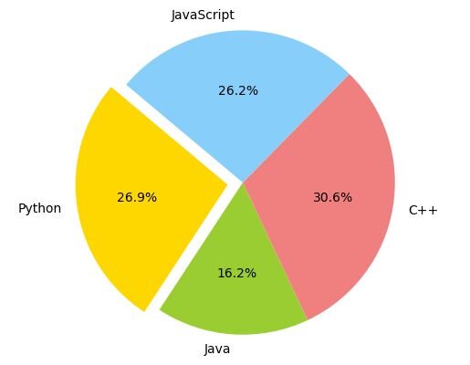
Example pie chart showing the distribution of preferences for programming languages: Python, Java, C++, and JavaScript. Created with Julius AI
Pie Charts
Don’t let the recent wave of hate for pie charts fool you. These handy tools will never go out of style! Why? It’s simple. They’re easy to follow, beginner-friendly, and effective at their job.
But what is their “job” exactly?
It’s to show how a single data point relates to the whole. This makes them ideal for illustrating concepts like market share, budget allocation, or survey responses.
Just avoid using them when you need to display more complex information or compare multiple data sets. In these cases, they simply become too cluttered and difficult to read.
Bar Charts
A bar chart is another popular data visualization method, mostly because it’s exceptionally easy to use (and read). In this chart, there are two axes. The first shows the categories being compared, while the second displays the measured value.
Interestingly, the primary disadvantage of these charts directly results from their simplicity. While they excel at comparing discrete categories and groups, they can become less effective when used to compare a large number of categories. After all, you don’t want your axes to go on forever!
Heat Maps
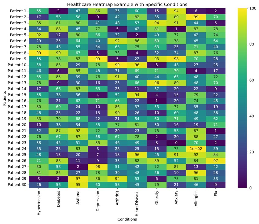
Are you looking for data visualizations that let colors do most of the talking? If so, heat maps are the way to go. These visualization types show differences in data points using color gradients. Throw a clear legend into the mix, and these maps can be read and interpreted in a heartbeat.
As for their applications, they’re ideal for summarizing the relationship between two variables. For instance, you can use them to show how the time of day impacts traffic on a website, marking the times of most visits with the most prominent color.

Example of a heatmap depicting health scores for 30 patients across 10 specific conditions. Each cell represents the health score of a patient for a particular condition with the color intensity indicating the severity of the condition. Created with Julius AI
Histograms
At first glance, histograms might appear similar to bar charts. However, these data visualization types differ in that they represent continuous data rather than discrete categories. Their primary goal is to show when data is skewed or concentrated in a specific area.
Best use cases? Anything that involves analyzing the distribution of numerical data. That’s why you’ll often see histograms in fields like finance, quality control, and demographics.
Gannt Charts
Gantt charts and project management go hand in hand. Using these handy charts, you can easily illustrate a project timeline, task progression, or resource allocation.
Like bar charts, they consist of two axes. But here, one axis represents the tasks making up the project, while the other lists the time intervals. Thanks to the horizontal bars in the chart’s body, you can also see the duration of each task.
Treemap Charts
Sure, a treemap chart might be less recognizable than other items on our list. However, you can’t go without it when visualizing hierarchical data.
The name of this chart comes from its visual appearance, which resembles a tree. But instead of leaves and fruits, you’ll see rectangles varying in size and color to signal their importance and category.
Use treemaps for data analysis that requires large volumes of information and a high number of categories (e.g., inventory management).
Scatter Plots
A scatter plot is a common technique for visualizing data that contains two continuous variables. Each data point is nothing more than a dot on the chart, positioned somewhere between the x-axis and its y-counterpart.
This makes scatter plots ideal for visualizing fairly large data sets. You get to see all the patterns and trends quickly, yet you don’t feel overwhelmed. Talk about a win-win scenario!
Tips for Creating Great Data Visualization
Choosing the right data visualization type for the job is just the beginning. Lots of additional steps are needed to ensure your visualization communicates the intended message. And that it does so effectively.
So, start by considering your target audience. After all, they’ll be the ones reading your visualization.
Then, keep it simple. No visual elements distracting from the main point are allowed!
As you go, be mindful of your color choices. Sure, your charts and graphs should be visually appealing. However, they should also be accurate and accessible to everyone.
But color isn’t the only element to keep in mind. You should also remember all the other graphic design principles. Place the emphasis on data, but don’t overlook elements like typography, layout, and visual hierarchy. These can go a long way toward telling your intended story for you.
Get Started with Julius AI to Enhance Your Data Visualization Techniques
Do you find following all the best data visualization practices too challenging? If so, don’t worry; there’s an easier way to do this. It’s called Julius AI.
Julius AI is the ChatGPT of data and math. It can help you create visually stunning graphs, maps, and tables in no time and with minimal effort.
Try out Julius AI today and see why it’s considered one of the most powerful data visualization tools around.
Frequently Asked Questions (FAQs)
What are the 5 C's of data visualization?
The 5 C's of data visualization are clarity, context, consistency, customization, and color. These principles ensure your visualizations are easy to understand, relevant to the audience, maintain uniformity across designs, are tailored to the specific data story, and use color effectively to highlight key points without overwhelming the viewer.
Is SQL a data visualization tool?
No, SQL is not a data visualization tool but rather a powerful language for querying and managing data. However, it can serve as a backbone for data visualization by preparing and extracting data, which can then be visualized using tools like Tableau, Power BI, or Julius AI.
How do I choose a data visualization tool?
Choosing a data visualization tool depends on your data needs, technical expertise, and budget. Start by identifying the type of data you’re working with and the insights you aim to communicate. Then, evaluate tools for their ease of use, customization options, integration capabilities, and overall cost-effectiveness.
What are advanced visualization techniques?
Advanced visualization techniques include methods like heat maps, treemaps, network graphs, 3D scatter plots, and interactive dashboards. These techniques go beyond standard charts to provide deeper insights and allow users to explore complex relationships or large data sets interactively.
