How to Prepare Your Data and Run Descriptive Statistics with Julius
This article will walk you through how to perform the essential steps in data preparation to ensure your dataset is cleaned, structured, and ready for data analysis.
Introduction
Data cleaning and processing is a crucial part of any data analysis. If datasets are not properly cleaned and prepared, it can lead to unreliable data interpretation and misleading results. The process of checking for inconsistencies and addressing them before you perform further analysis can help mitigate the potential of it becoming a bigger issue as you continue your analysis. Cleaning and preparation of your dataset can be anything from removing null entries, columns or rows, to standardization or simplification of your headings.
After properly cleaning and processing your data, a common next step is to perform descriptive statistics. Descriptive statistics are used to get a quick summary of a dataset, and display potential characteristics or trends. They can be in the form of graphical representations (e.g. histograms, Q-Q plots, and boxplots), or pure calculations of central tendency, dispersion, and so forth.
Dataset Overview
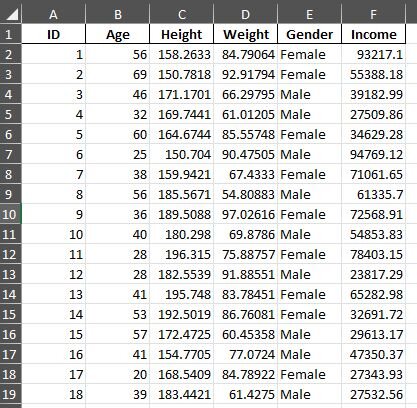
The dataset we will be using in this example is called “recreated_dataset.xlsx”, and was generated by Julius for the purpose of this use case. This dataset contains variables that fall under demographic data, which include: ID, Age, Height, Weight, and Income. The total sample size for this dataset is N= 104. This dataset can be accessed here.
Step-by-Step Walkthrough
Step 1: Import your dataset into Julius.
The AI can read data in multiple formats including CSV, xlsx, Google Sheets, PDF, and much more. Once your data is uploaded, the column headers, first several rows, and any variables will be passed as context to help the AI model get an understanding of the nature of the dataset. But, before we begin performing our analysis, we should carefully examine our headers.
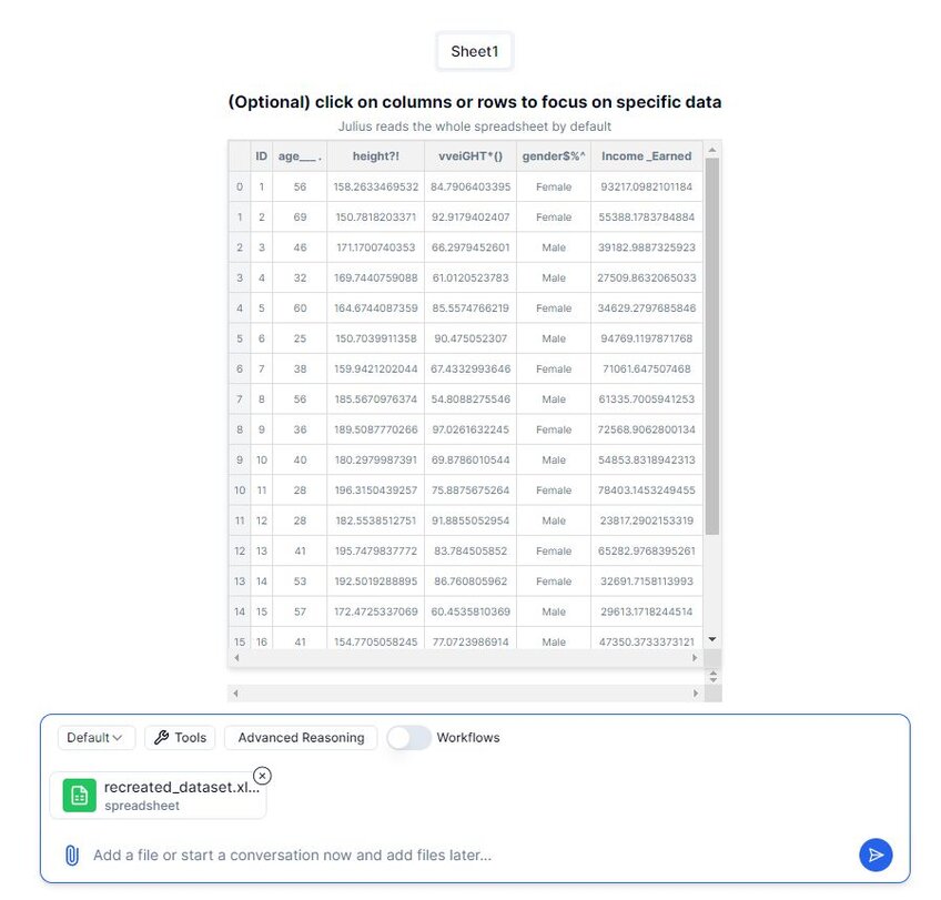
Adjusting your headers so that they are easy to read is a critical step in the data analysis process. Let’s address the issues with our headers.
Step 2: Addressing Poorly Formatted Headers
Within the data upload flow, there is an automated check to determine if the data is properly formatted with correctly composed headers. Listed below are a few examples of “bad headers” and how to fix them:

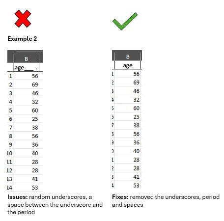
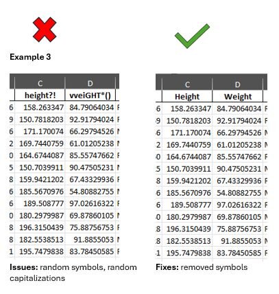
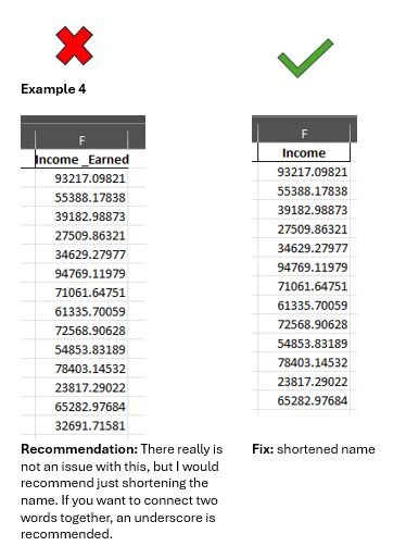
Once we’ve addressed the issues with our headers, we can move forward in the data analysis process.
Step 3: Creating a new chat & starting data cleaning
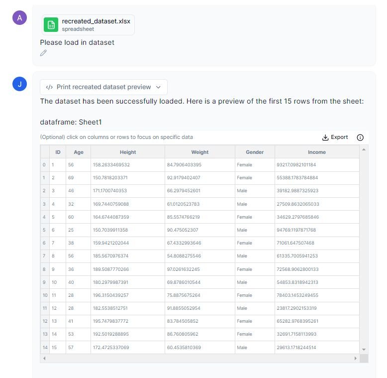
To start the process of data cleaning, we can load in our data and start a new chat in Julius by typing out a message in the input bar and pressing submit.
Data cleaning is an important step in the process of data analysis. Sometimes you may have data that has missing entries or zeros. These discrepancies can interfere with the analytical process as they can introduce bias, can lead to inconsistent conclusions, and create errors in data analysis & running code.
Prompt: “Please load in dataset.”
Step 4: Identify any rows or columns that contain missing values
Now let’s ask Julius to identify any rows that may be missing data so that we can address it.
Prompt: “Can you identify any columns or rows with missing data?”
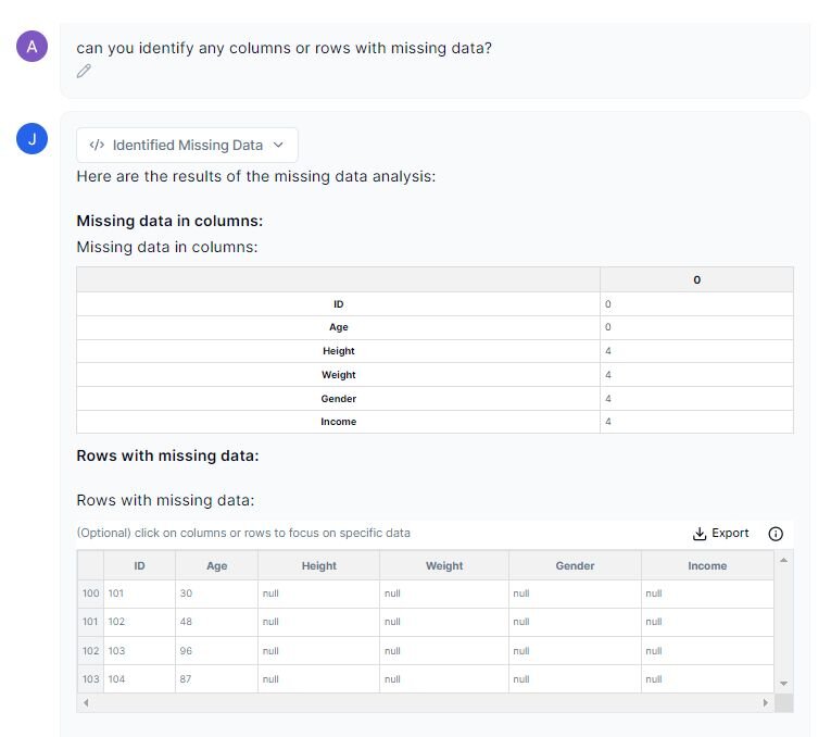
The dataset contains 4 rows of missing data starting at row 100 through 103. We will remove these entries in the next step as it will still leave us with a large sample size (N=100).
Some common approaches to dealing with missing data is to remove the values, or you can replace the values with the median or mean. However, you should be mindful about these approaches as it can introduce bias into your results. If you are concerned about this, further research may be warranted in order to decide what option you should choose.
Step 5: Creating a new dataset without missing values
Let’s ask Julius to recreate our new dataset, removing the last four rows:
Prompt: “Please remove the rows with missing data and update dataset.”
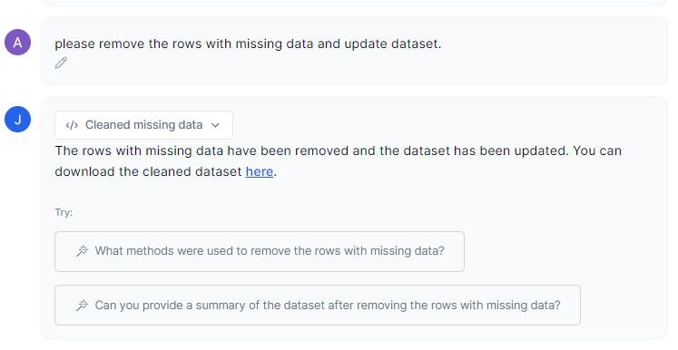
You can easily download the new dataset by clicking on the “here” link. You can either create a new chat and upload the new dataset, or you can proceed in the same chat, as the new dataset will be saved and become the new active dataset in the chat.
Step 6: Performing Descriptive Statistics: An Overview
While there is not a particular hard-and-fast rule on how to go about calculating and analyzing descriptive statistics, I’ll give you an outline that I like to follow:
1. Calculate measures of central tendency and measures of variability
a. Mean, median, mode (central tendency)
b. Standard deviation, standard error, minimum and maximum variables, interquartile ranges (IQR) (measures of dispersion)
c. 95% Confidence Interval (CI)
2. Create Histograms to visualize normality
a. Calculating skewness and kurtosis values will reveal some information about the distribution of your dataset, but creating histogram charts will help you visualize it and get a more nuanced understanding
3. Q-Q Plots
a. Allows you to assess if your set of data follows the theoretical normal distribution (the red line in the graphs below)
4. Boxplot to assess outliers
a. Some statistical tests are sensitive to outliers, so they should be identified and assessed through box plot visualizations
5. Normality Test
a. This test is used to identify whether your dataset is normally distributed, which is an important assumption for most parametric tests
b. If your dataset fails the normality test, you can attempt to transform your data (log transformation, square root transformation, cube root transformation, box-cox, etc.)
i. Each transformation has its own requirements and use, so additional consideration needs to be taken before applying them.
ii. If a dataset still still fails normality, nonparametric tests need to be performed
6. Homogeneity of Variances
a. Like the normality test, homogeneity of variances is a requirement in many parametric tests. If your dataset fails this, nonparametric tests should be considered as an alternative.
This outline should help you get started with understanding some of the characteristics of your dataset, while also helping to identify which statistical tests you should consider.
Step 6a: Central Tendency, Measures of Dispersion, 95% CI
Let’s take a look at the output Julius gave us for central tendency, measures of dispersion, and 95% CI.
Prompt: “Let’s look at central tendency, measures of variability, 95% CI and IQR, minimum and maximum values. Please do this for age, height, weight, and income column. Please also explain the meaning of each.”
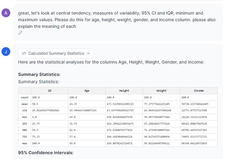
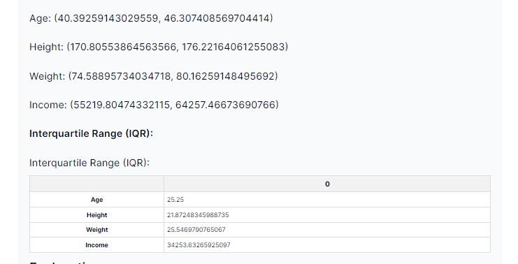
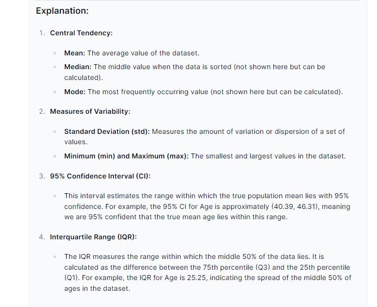
Now we have an idea of what the main features are in each of the variables as well as a quick overview of the dataset.
Step 6b: Histograms, Skewness and Kurtosis, and Q-Q Plots
To understand if our dataset is normally distributed, we can create histograms, calculate the skewness and kurtosis values, and perform Q-Q plots.
Prompt: “Let’s look at the histograms of each variable separately. Explain kurtosis and skewness and provide the values for each. Also bring in Q-Q plots for each variable.”
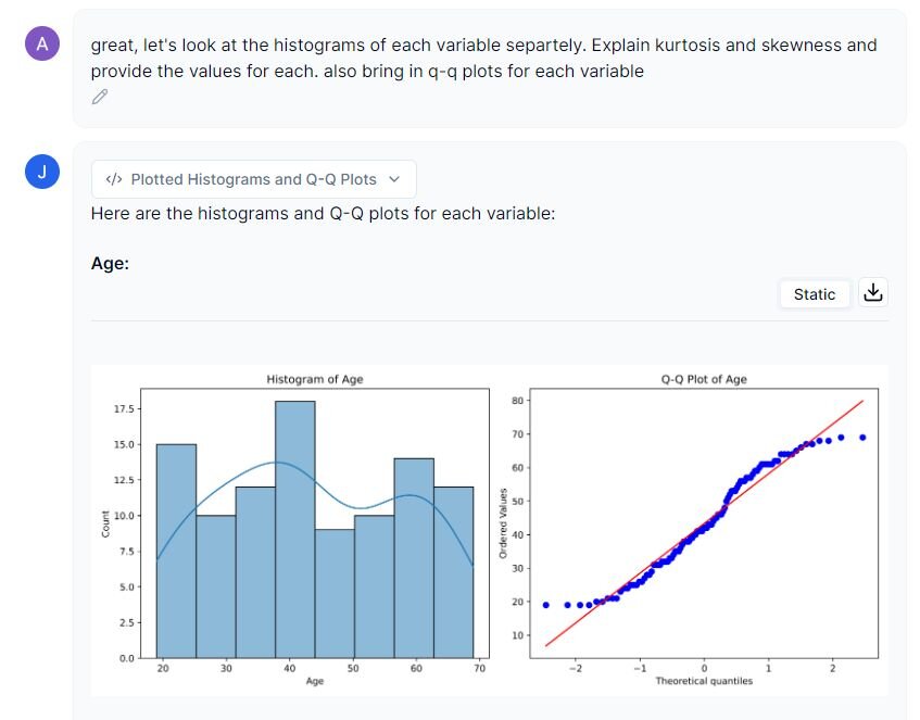
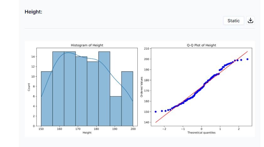
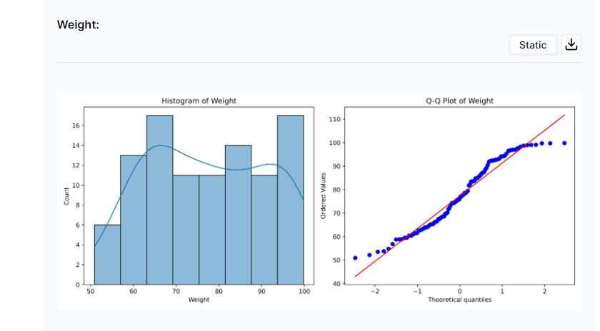
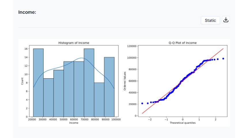
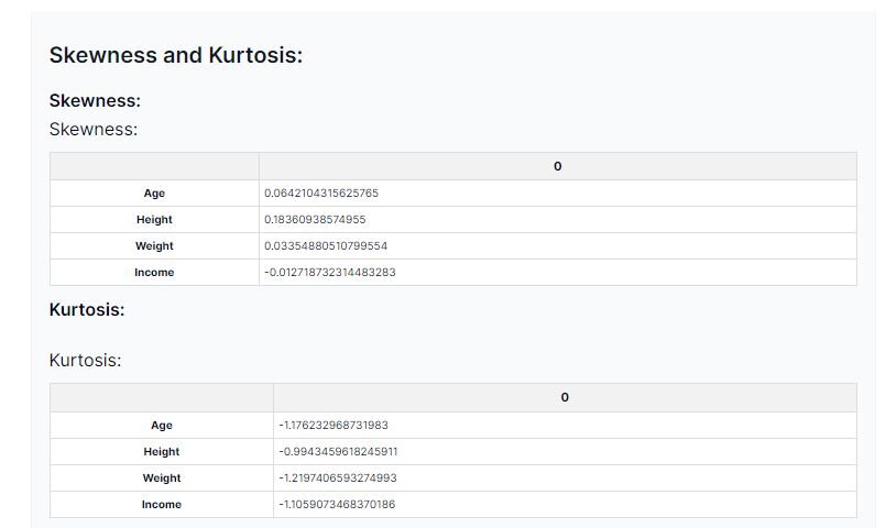
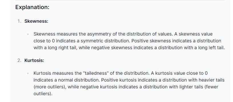
In summary, our dataset seems to be non-normally distributed, as indicated by the skewness values. However, to confirm this visualization, we should run further analyses.
Examining the kurtosis values, we can see that they are all negatively distributed and closer to -1. This indicates fewer outliers in the dataset. We will visualize the outliers by using a boxplot.
Step 6c: Checking for Outliers
There are a couple ways to check for outliers with Julius:
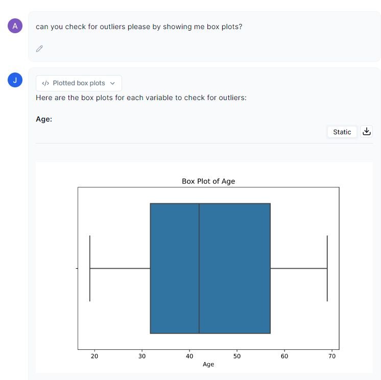
1.Create box plots to visualize the outliers:
Prompt: “Can you check for outliers please by showing me boxplots?”
2. Ask Julius to create a table of outliers for each variable:
Prompt: “Can you check for outliers please.”
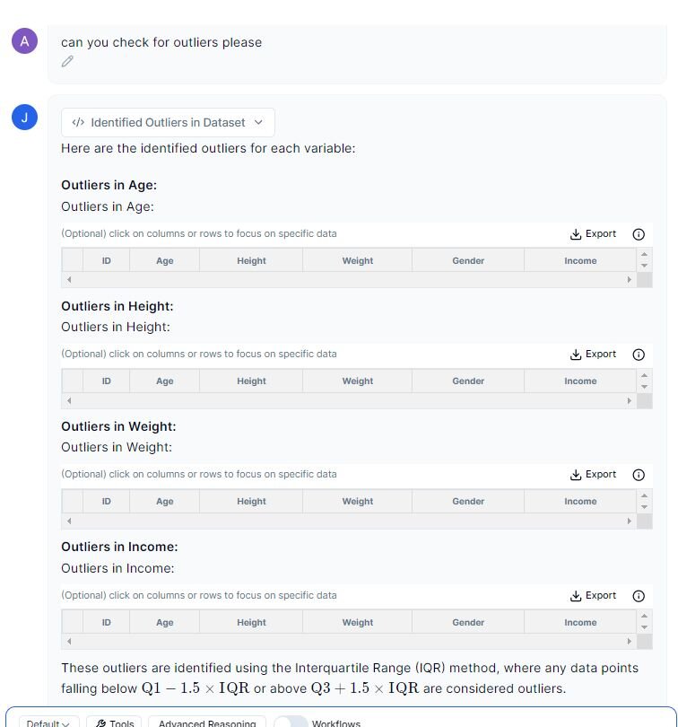
We do not have any dots outside of the upper or lower bounds of the IQR (the ends of the boxplots), and Julius has also indicated that there are no outliers via the created tables.
Step 6d: Performing Normality Test and Homogeneity of Variance on variables
Performing normality and homogeneity of variances is important as many statistical analyses require datasets to follow normal distributions and/or assume that the variances across the groups are equal. Looking at the Q-Q plots and histograms Julius created, I have some reservations about our dataset being normally distributed, so let’s check.
Prompt: “Please perform a normality test and homogeneity of variances on each variable.”

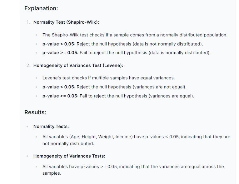
For both the normality and homogeneity tests, if the p-value is under 0.05, we can reject the null hypothesis. From a statistical standpoint, all of our variables are non-normally distributed, but they do contain homogeneity amongst their variances.
Since our dataset failed the normality test, this means that we cannot perform parametric tests (p-value is under 0.05 in normality). Hypothetically speaking, you could try to transform your dataset to see if it will change the normality, but please take care in choosing which transformation you want. This means that for further statistical analyses, non-parametric tests should be considered.
Conclusion
We now know how to do the following: create proper headings, address nulls or missing data, perform descriptive statistics, and generate graphical depictions to identify trends in our dataset. By carefully following these steps laid out in this use case, you should be able to quickly get an understanding of your dataset, and conclude if your dataset passes the normality and homogeneity tests. Whether you are new to data analysis, or a veteran, Julius can help you seamlessly perform data cleaning and descriptive statistics.
